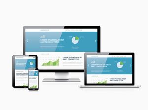
Mobile and Tablet web design
 Having just completed mobile optimised websites for 2 of our clients, it seems a timely opportunity to review the latest thinking around the subject.
We covered the differences between “adaptive web design” and “responsive web design” in our article of the 24th January 2014. For those of you who missed this article, here are the basics put as simply as possible:
Adaptive web design uses the server to detect the device being used (eg. mobile, Tablet, Desktop) and serves the content in a layout specifically designed for that device; for example, you may get a different design for each device. A large image that is not needed on a mobile phone may be removed completely when the website is viewed on a mobile phone.
Responsive web design uses the browser to automatically rearrange content on the website. If you were to reduce your browser window making the width smaller, the content will move to fit the new window size. The design remains the same for all devices.
To muddy the waters even more, there is now a third method being discussed – RESS. This method uses the Adaptive web design method under a different name. However, some would argue it uses a combination of Adaptive and Responsive web design. For example; the home page could be adaptive while the rest of the pages are responsive.
We can advise you on the best method for your website and carry out research to find out what devices your website visitors are using.
Mark Langston